Data visualization has always been about making information understandable. But in 2026 and beyond, understanding is no longer enough. We now demand intuition, emotion, context, and sometimes even physical experience from data.
Traditional bar charts, line graphs, and pie charts still serve a purpose. But when datasets grow complex, multidimensional, and fast-moving, old visual metaphors start failing. Analysts today are not just storytellers — they are experience designers.
This article explores radical, unconventional, and futuristic data visualization techniques that go far beyond dashboards. Some already exist in niche use cases, some are emerging, and some are waiting for the right tools to mature.
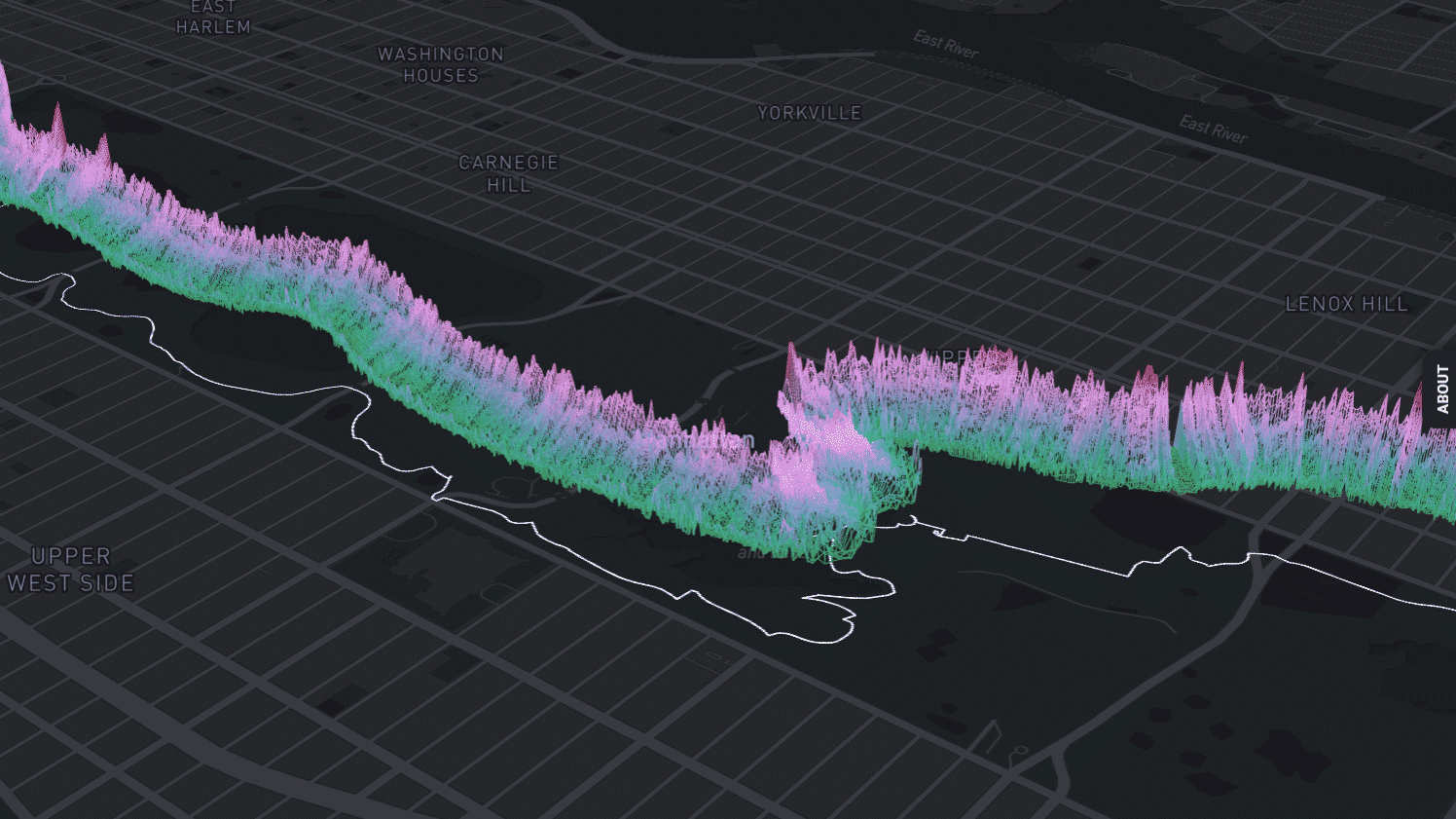
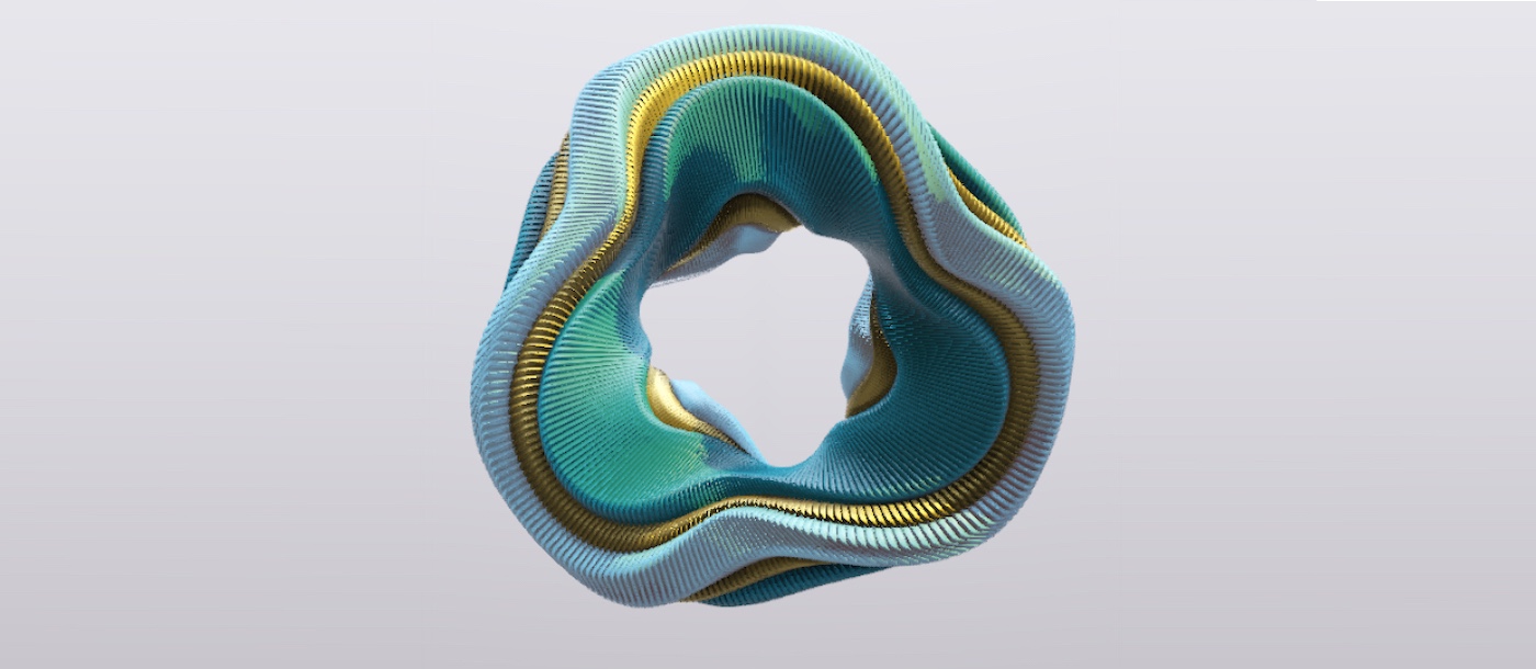
1. Spatial Data Sculptures (Data as Physical Space)


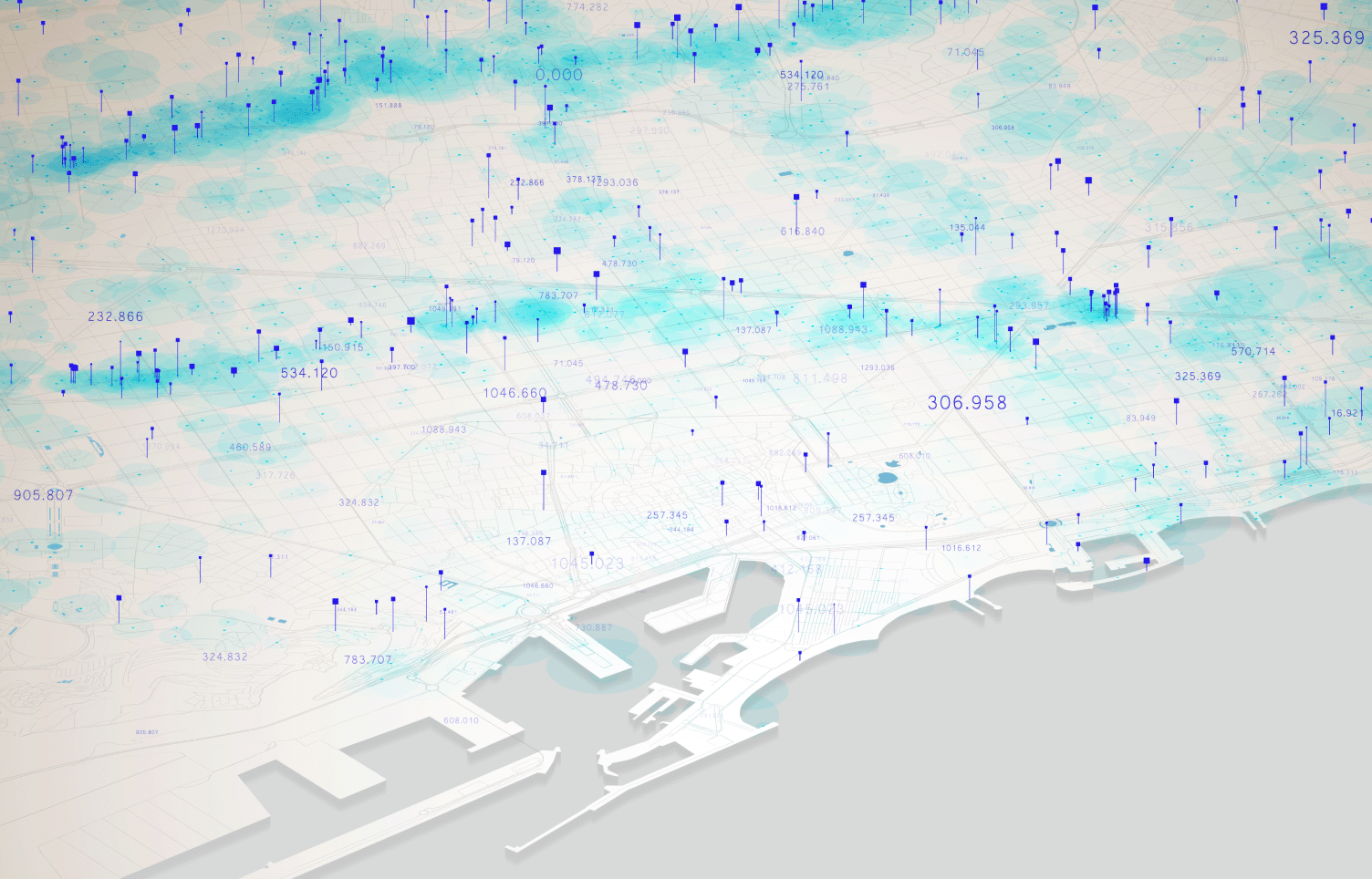
What if your dataset wasn’t on a screen, but around you?
Spatial data sculptures transform data into three-dimensional physical or virtual objects. Instead of reading numbers, users walk through the data.
How it works
- Data dimensions map to height, depth, density, or curvature
- Clusters become physical groupings
- Outliers literally “stick out”
Why it’s powerful
- The human brain understands space better than tables
- Patterns become visible without explanation
- Memory retention is significantly higher
Real-world use cases
- Urban planning (traffic, population density)
- Climate modeling
- Portfolio risk visualization
In the future, expect VR-based boardrooms where executives walk through revenue structures like architectural models.
2. Narrative Timelines That Adapt to the Viewer


Most timelines are static. But data stories shouldn’t be.
Adaptive narrative timelines change what they show and how they show it based on:
- Viewer role
- Prior interactions
- Attention patterns
What makes them different
- Executives see summaries first
- Analysts see raw anomalies
- New users get guided storytelling
Why this matters
Data storytelling fails when context is missing. Adaptive timelines supply context dynamically instead of overwhelming everyone equally.
Think of it as Netflix personalization — but for analytics.
3. Emotional Data Visualization (Beyond Numbers)


Some data isn’t meant to be “read.”
It’s meant to be felt.
Emotional data visualization translates datasets into:
- Color moods
- Motion intensity
- Sound frequency
- Visual tension
Example
Customer feedback data becomes a living canvas:
- Calm colors = satisfaction
- Sharp spikes = frustration
- Slow movement = apathy
Why this works
Humans are emotional decision-makers first and rational ones later. Emotional visualization bridges the gap between analytics and intuition.
This technique is especially powerful in:
- UX research
- Mental health analytics
- Social media sentiment tracking
4. Data as Sound (Sonification)
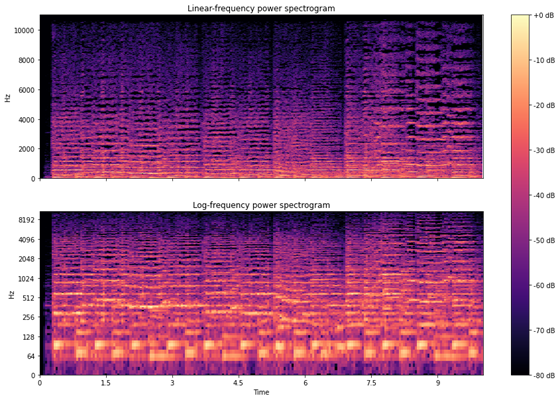
What if you could hear anomalies before seeing them?
Data sonification converts values into:
- Pitch
- Rhythm
- Volume
- Harmony
Why sound works
- Humans detect pattern changes in sound faster than visuals
- Continuous monitoring becomes passive
- Accessibility improves for visually impaired analysts
Practical examples
- Network security monitoring
- Financial market volatility
- Manufacturing sensor data
A sudden pitch distortion can indicate a system failure before a dashboard alert ever triggers.
5. Living Dashboards (Data That Evolves)

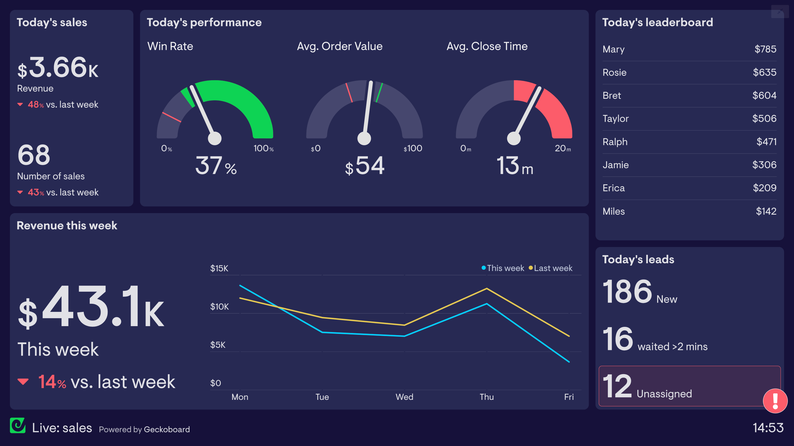

Most dashboards are frozen snapshots refreshed every few seconds.
Living dashboards behave more like organisms:
- Elements grow, shrink, breathe
- Important metrics move to the center
- Irrelevant data fades away
Key idea
Data visualization should respond to significance, not just updates.
Example
In an admissions dashboard:
- A sudden drop in applications enlarges itself visually
- Stable metrics quietly recede
- Risk indicators pulse subtly
This reduces cognitive overload while improving reaction speed.
6. Multisensory Visualization (Touch, Motion, Haptics)
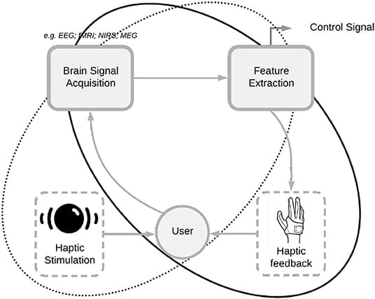


Screens are just one sense.
The future uses five.
Techniques include
- Haptic feedback when thresholds are crossed
- Resistance-based sliders for probability
- Gesture-based filtering in 3D space
Why this matters
Complex data becomes intuitive when users physically interact with uncertainty, confidence, and scale.
This is especially promising for:
- Scientific research
- Medical diagnostics
- Training simulations
7. Data Constellations (Non-Linear Relationships)
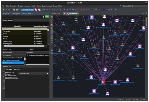
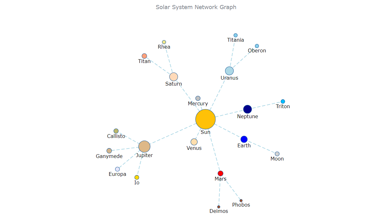
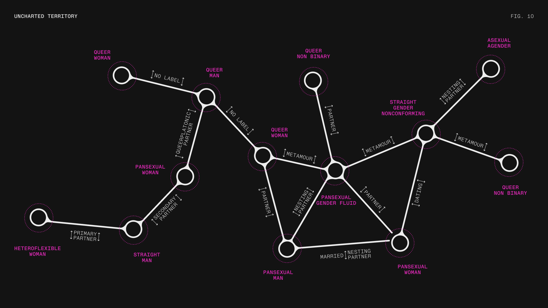
Linear charts assume linear thinking.
Reality is messy.
Data constellations visualize relationships as star systems:
- Nodes = entities
- Distance = similarity
- Gravity = influence
What becomes visible
- Hidden clusters
- Weak ties
- Structural holes
This method is powerful for:
- Social networks
- Fraud detection
- Knowledge graphs
You don’t “read” these charts — you explore them.
8. Algorithmic Art as Analytics

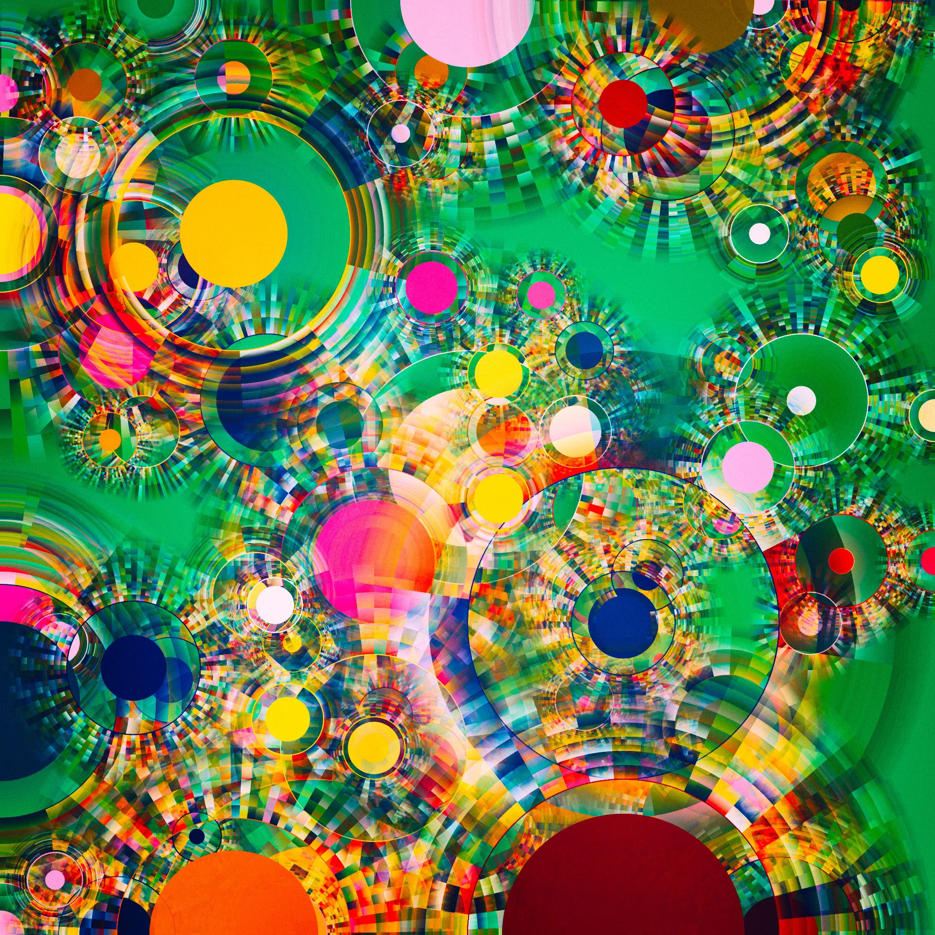
Sometimes beauty reveals truth faster than precision.
Algorithmic art uses rules derived from data to generate evolving visuals that expose:
- Stability
- Chaos
- Balance
- Extremes
Why it works
Patterns that escape traditional statistics often emerge visually in generative systems.
This approach is increasingly used in:
- Financial modeling
- Climate simulations
- Complex systems research
It’s analytics for pattern intuition, not reporting.
9. Explainable AI Visualizations (Inside the Black Box)
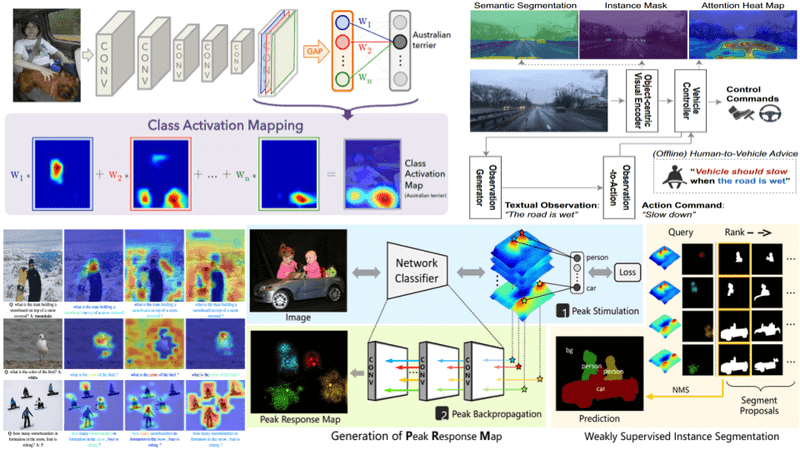
As AI systems make decisions, visualization must explain why.
New techniques visualize:
- Feature influence paths
- Confidence decay
- Alternative decision routes
Example
Instead of showing “loan rejected,” the visualization shows:
- Which factors mattered most
- Which ones were close
- What could change the outcome
This is critical for:
- Compliance
- Trust
- Ethical AI deployment
10. Time-Folding Visualizations
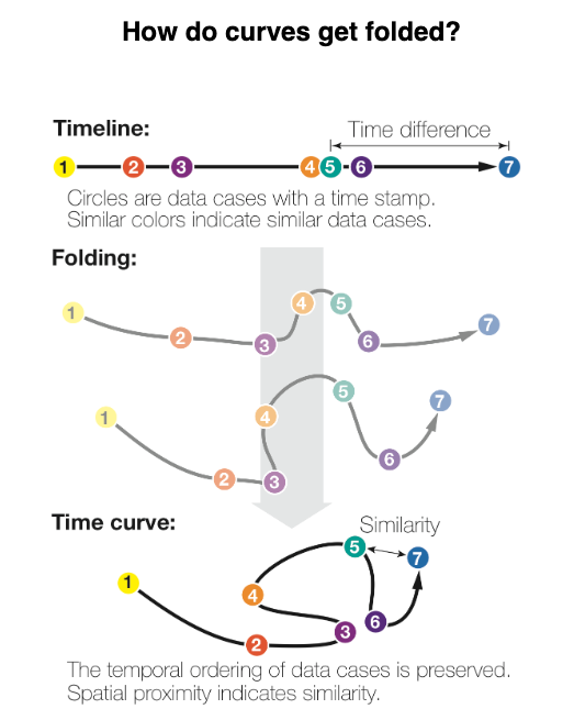
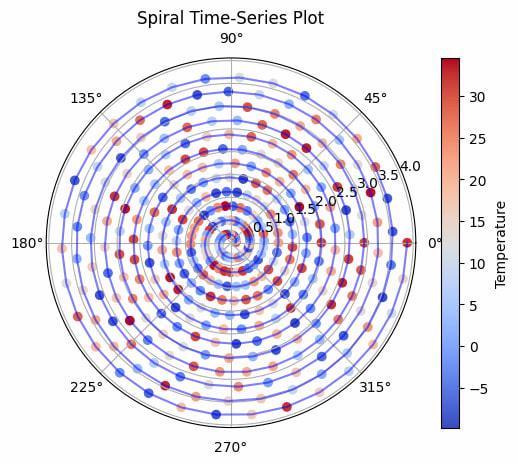
Time is usually flat in charts.
But time is cyclical in reality.
Time-folding visualizations:
- Spiral timelines
- Layered temporal loops
- Collapsible histories
Why this is revolutionary
Seasonality, recurrence, and long-term drift become instantly visible.
Used effectively in:
- Marketing performance
- Academic cycles
- Behavioral analytics
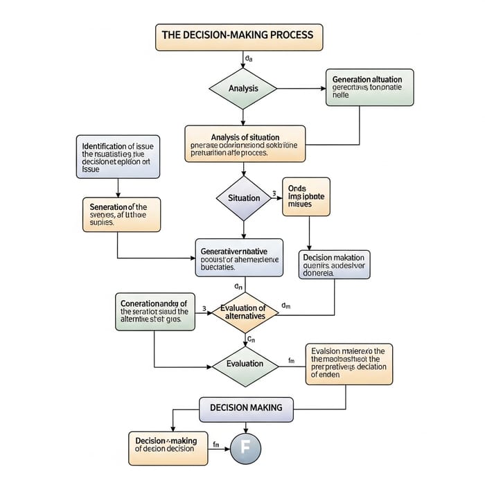
11. Decision-Centric Visualizations (Action First)
Most visualizations show data.
Few show decisions.
Decision-centric visualizations start with:
- Available actions
- Associated risks
- Opportunity costs
Data supports decisions instead of overwhelming them.
This is where analytics meets strategy design.
12. Personalized Cognitive Visualizations
Not everyone thinks the same way.
Future systems will adapt visuals based on:
- Cognitive style
- Past interactions
- Decision speed
Visuals may become:
- Text-heavy for analytical thinkers
- Spatial for visual thinkers
- Narrative for strategic leaders
The dashboard becomes a mirror of how you think.
The Future: Visualization as an Interface to Reality
Data visualization is no longer about charts.
It is becoming:
- Experiential
- Emotional
- Adaptive
- Ethical
The best visualizations of the future won’t feel like tools.
They will feel like extensions of human perception.
The analyst’s role is evolving from “chart builder” to sense-maker.
And those who master these new visualization paradigms won’t just explain data —
they’ll shape how decisions are made.